I could take a lab test approach to my dilemma of choosing between the iPhone 12 mini and the iPhone 12 Pro Max cameras. Buy both phones. Mount them on a tripod to ensure I was getting pixel-perfect alignment. Take test shots in all conditions. Compare 100% crops.
But there have already been enough of those to persuade me that the differences are real, if small. The question for me is all about whether I can cope with the size of the Max.
Taking one of my favorite walks, with photos along the way, provided one opportunity to find out. I took my iPhone 11 Pro along too, so I could compare the results …
A comparison between my iPhone 11 Pro and the iPhone 12 Pro Max isn’t strictly relevant from an end-result perspective – I already know I’ll be trading in last year’s phone for one of the new ones – but it’s interesting anyway. Mostly, though, it served as a useful handling test.
On the results side, what I found was that the differences between old and new phones were largely unnoticeable at web-viewing sizes – but do show up on close examination.
The iPhone 12 Pro Max did seem to be consistently upping the exposure a touch over the iPhone 11 Pro, though I must stress that all my shots were handheld, so minor differences in framing could account for it. That said, however, it was consistent: there were no occasions where the older phone exposed more than the new one.
Here’s an example (iPhone 11 Pro left):
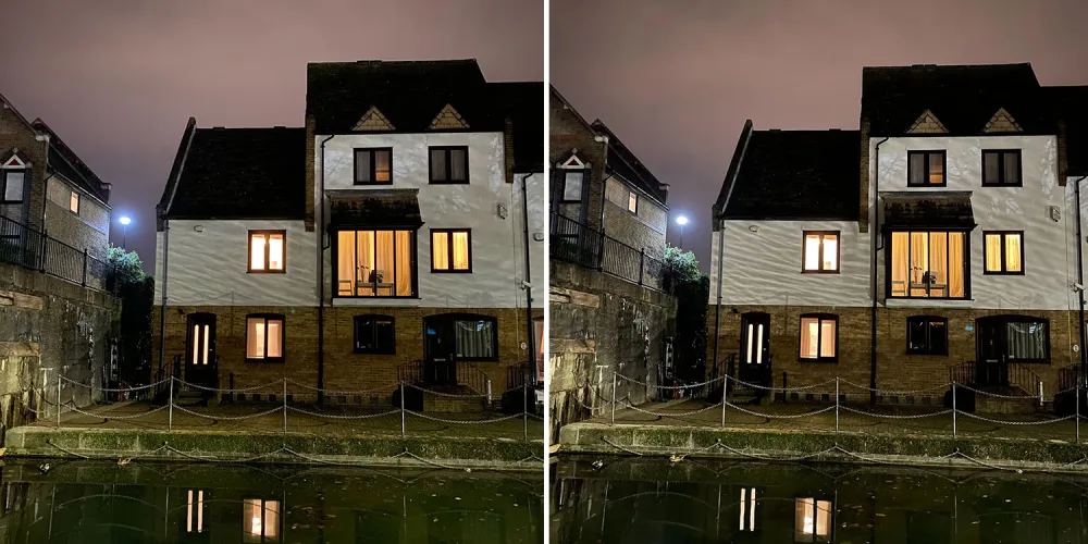
It was fully dark when these shots were taken – much darker than it looks. I wasn’t 100% sure that the water reflections on the house would even show up, but they do, very clearly. You can see the iPhone 12 Pro Max shot is brighter.
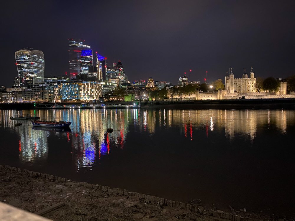
I was hoping the larger sensor would result in less noise, and was pleased to find that this was the case. However, the difference is rather subtle and only shows up clearly in 100% crops. Here’s an example. First the iPhone 11 Pro:
Then the iPhone 12 Pro Max:
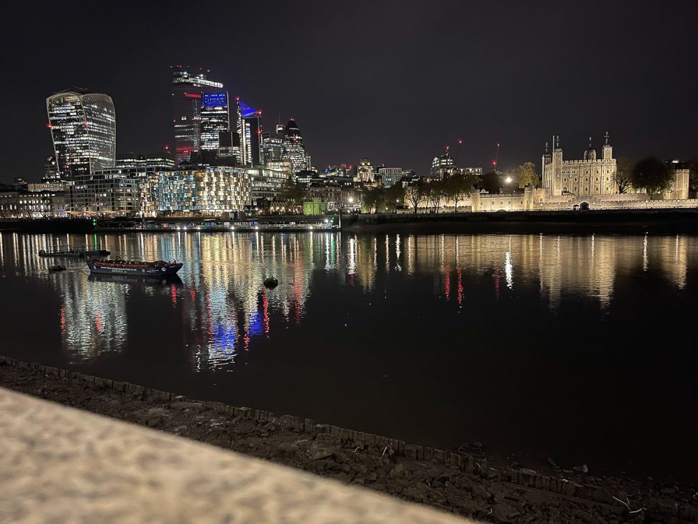
At these sizes, there’s not a lot different between them. Take a close look, however, and it’s a different story (iPhone 11 Pro left):
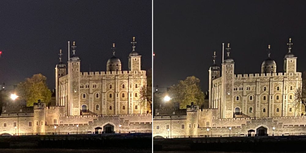
Look very closely at the sky, top-left, and you can see noticeable grain in the iPhone 11 shot, and a very much smoother sky from the iPhone 12. But you do have to put your face pretty close to the screen to see it.
Now, does this sort of difference matter? For 99.99% of shots, not even slightly. But for travel, where I might want to put together a photobook, or to create a large print, then yes, a little bit. More about this in the Initial conclusions section at the end.
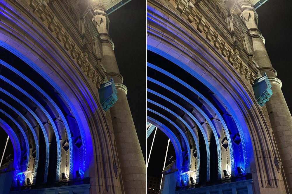
In addition to less noise, there’s slightly more detail in the iPhone 12 shots, and this does sometimes show up even at web size. First the full images (iPhone 11 left). Take a look at the detail in the stonework in the front of the arch:
Now close crops to give a better look (iPhone 11 top):
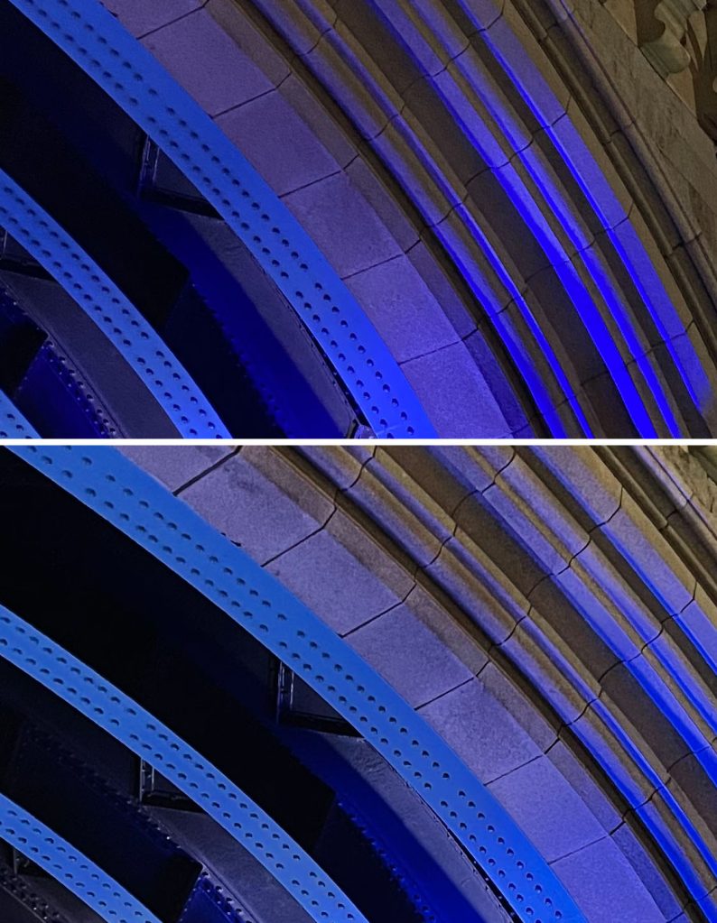
The increased exposure plays a part for sure, but the difference in detail extends beyond that, and I again found this across a range of photos.
Where else is this extra detail coming from? I suspect it’s a mix of three factors.
First, the slightly wider aperture lens means a little more light enters, so exposure times can be slightly shorter, resulting in sharper images. Examining the metadata, the differences I saw in exposure time were very minor (for example, 1/6th versus 1/5th of a second in one, 1/9th versus 1/8th of a second in another), but it all helps.
Second, the generational improvement in sensor and processing tech. The hardware keeps getting incrementally better, and Apple’s image-processing algorithms likewise.
Third, the larger sensor. There’s no way to tell just how much of a role this plays, but the more scientific comparisons carried out by others of the 12 Pro versus the 12 Pro Max do definitely provide persuasive evidence that it plays a part.
I could show more side-by-side crops, but they all show the same two things: a bit less noise, and a bit more detail.
Combined Portrait and Night modes
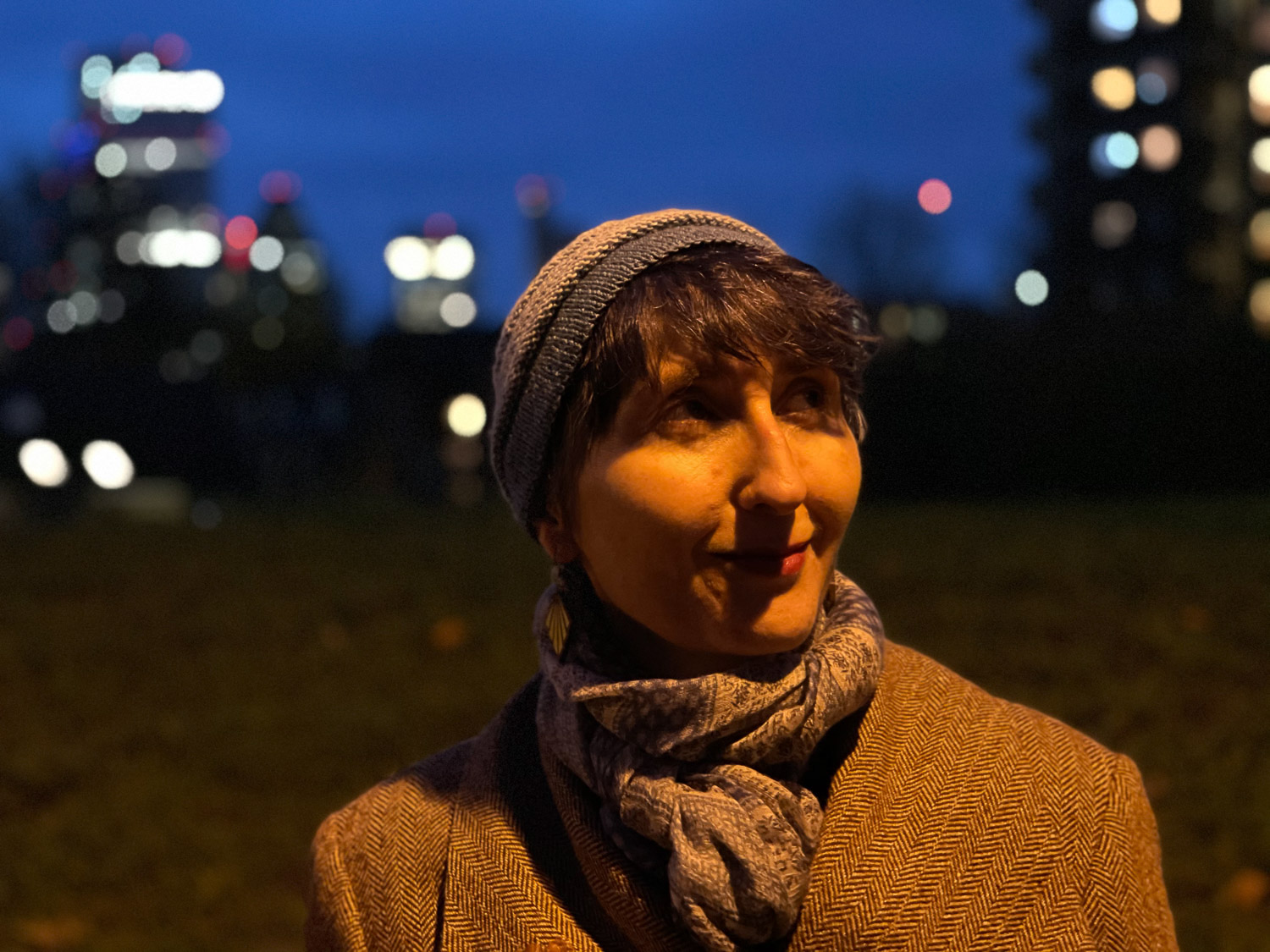
One objective difference between the iPhone mini and iPhone Pro Max is that the latter supports, for the first time, combined Portrait and Night modes.
It’s hard for both subject and photographer to hold completely still for three seconds, so the images from my first test ranged from a little soft to unusable. I think the reality is that you’d both have to work at getting good results – it’s not a tool you can use casually. But it did impress me enough to want to play more with it.
Here’s an example, lit by a street light in an otherwise dark park:
I’m hoping to be able to play more with this tonight – watch this space for an update.
More background blur?
Both a wider aperture lens and a larger sensor should result in shallower depth of field, increasing the amount of background blur in normal (non Portrait mode) shots.
Is this the case in practice? I’d say no. At best, to an absolutely insignificant degree. Compare the background buildings in these two shots (iPhone 11 left):
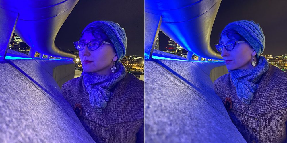
The more notable difference in these very low-light shots is that the wider aperture reduced the exposure time (1/13th in the iPhone 11, 1/20th in the iPhone 12), which produced a sharper image. I mean, there’s too much variability in this kind of casual shot to say that made the difference, but I again did consistently see small differences in exposure times, and every little thing helps.
You can again see a brighter exposure and more detail in the coat.
The most annoying camera fault is still present
The single biggest weakness I’ve found with the iPhone 11 Pro camera is internal reflections. If there are bright point light sources in the image, the reflections are really bad. Here’s an example I gave last year. That was a frame-grab from a video clip, but the same thing is seen in still photos.
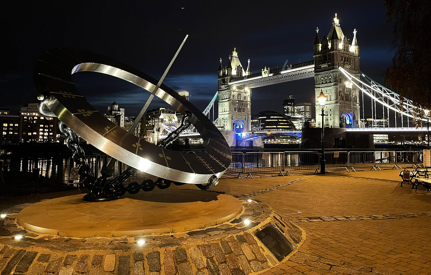
The same remains true of the iPhone 12 Pro Max. Take a look at the top photo (included again below for convenience). The dynamic range is really impressive. But look at that light streak to the right of the crest; that’s an internal reflection which really spoils the photo. I’d very much hoped Apple would have fixed that by now.
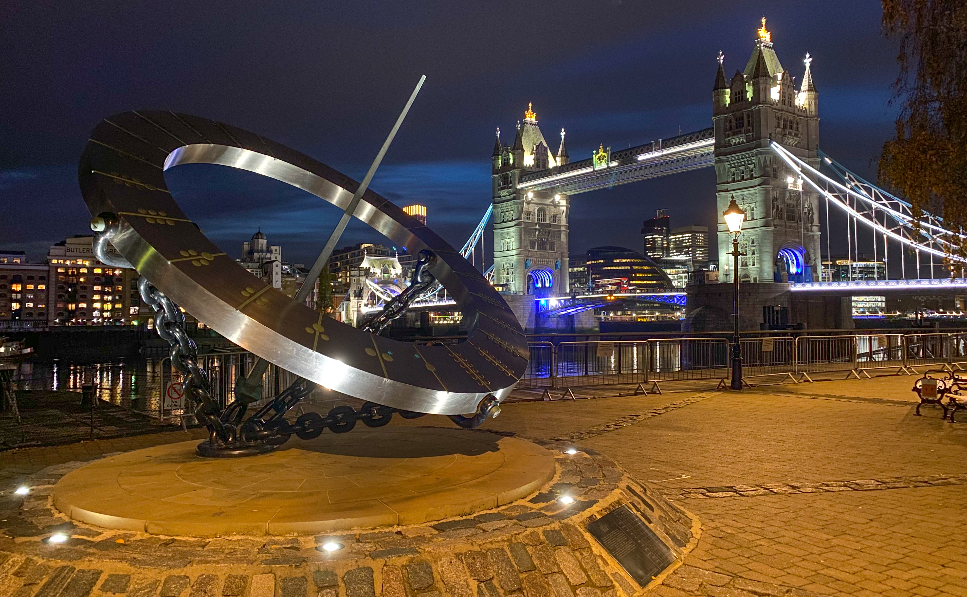
I wanted to show all sample shots completely unedited, exactly as they came from the camera, but here’s the same shot after a very minor edit to constrain highlights, boost shadows and boost saturation:
A few more examples
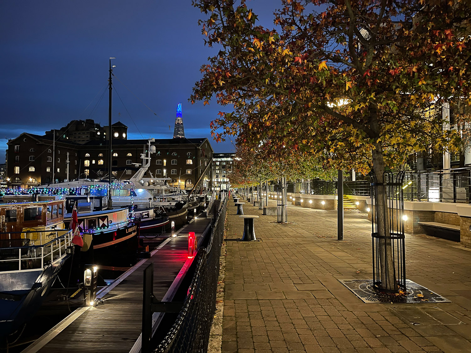
Here are a few more unedited sample night shots.


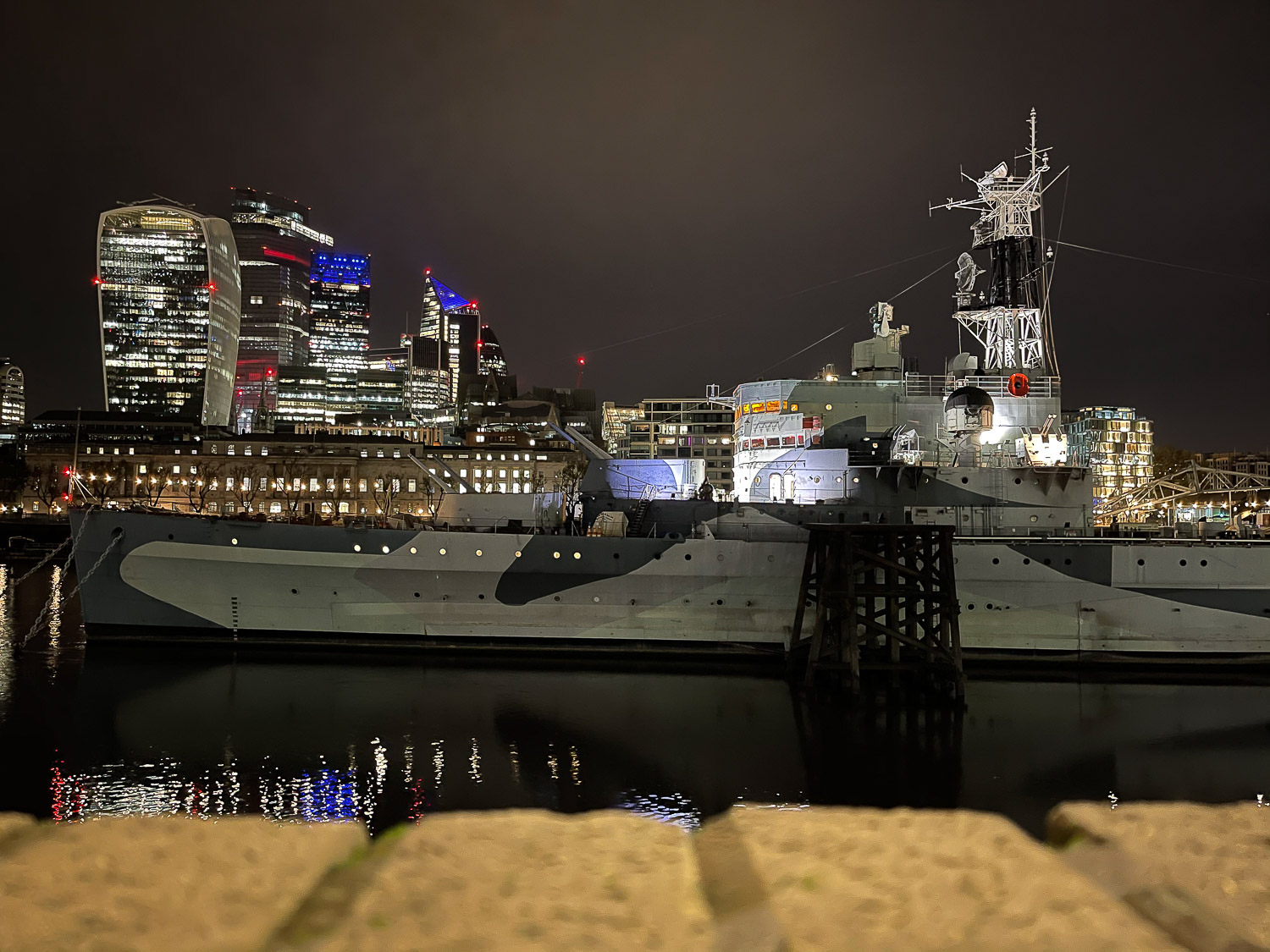
Handling, and large-screen viewfinder
I said last time that the phone feels big, and that is still very much the case. However, it doesn’t feel unwieldy in use, and that’s an important distinction. I was able to slip it easily in and out of my jacket pocket, and it feels comfortable and balanced in the hand when taking photos.
I suspected I was going to enjoy the larger ‘viewfinder’ provided by the large screen, and that is indeed the case. I still greatly prefer a real viewfinder, whether optical as in the case of my Nikon or electronic as with my Sony, but a larger screen definitely helps when composing shots and checking focus.
The larger screen is also nice when reviewing shots on the phone afterwards.
Wireless charging oddity
Nothing to do with photography, but … When the phone arrived, it charged happily on all three of my Choetech chargers. On Saturday, I realized it hadn’t charged overnight, and now wasn’t interested in charging on that stand. It still charged on the other two.
Later in the day, it stopped charging on a second one. Then when I tried the third, it had stopped charging on that too!
I tried all three with and without the case, without any difference. So now it doesn’t wirelessly charge at all on any of my chargers. This is a pain as well as a mystery, but I’ll live with wired charging for now until a third-party MagSafe stand is available. (All three chargers still charge my iPhone 11 Pro.)
Initial conclusions
In all honesty, the improvements even over the iPhone 11 Pro are small, and those over the iPhone 12 mini will be even smaller. The vast, vast majority of shots I take with my iPhone are snaps, taken for the memory. When people view them, it’s either on the phone itself, in social media, or at web resolution. For those, the improvements are almost entirely irrelevant.
For more important photos, it depends how they are viewed. Even for travel shots (where I do sometimes use my iPhone), the majority of them, I view the web-res versions in blog posts. Again, for those, the difference doesn’t really matter.
But … there are exceptions. There are shots that, once you see them, you want to include them in a photobook, or blow them up as a large print. For those, the difference could be visible.
Even so, just between friends, I’ll admit these differences are subtle ones, even in large prints. Even if it does turn out to be the sensor size that accounts for the biggest difference (thereby justifying the Pro Max over the mini), this isn’t – so far, at least – a compelling reason to stick with this phone over that super-cute and oh-so-pocketable baby sibling.
But the one feature that could yet prove compelling is combined Night and Portrait modes; I’ll report back on that once I’ve had more time to play with it.
If you’ve been trying out the camera in any of the iPhone 12 models, please share your own thoughts in the comments.
FTC: We use income earning auto affiliate links. More.
Check out 9to5Mac on YouTube for more Apple news:
"diary" - Google News
November 16, 2020 at 10:19PM
https://ift.tt/38P1zMu
iPhone 12 Diary: Night shots, and early thoughts on the camera - 9to5Mac
"diary" - Google News
https://ift.tt/2VTijey
https://ift.tt/2xwebYA
Bagikan Berita Ini


0 Response to "iPhone 12 Diary: Night shots, and early thoughts on the camera - 9to5Mac"
Post a Comment