For the covers of The Chronicle’s Throughline limited series, we commissioned artist Chaowat “Pong” Lertsachanant to create a series of eight panels depicting the future of San Francisco that would connect to form one large panoramic image.
Lertsachanant had to navigate difficult thematic content alongside format challenges. Having a large canvas meant more details to get right in an illustration depicting a city to its own citizens. Each panel was also extremely vertical, inverting the film-like shape that is typical in Lertsachanant’s animation work. And then each piece had to stand on its own while weaving into the larger final illustration.
Now that all eight pieces have been published, we asked Lertsachanant for his artist commentary on each panel and how he depicted a futuristic San Francisco, altered by the pandemic and protests, moving forward better.
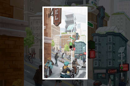
Week 1: The City
I lived in the Tenderloin before. I tried to recall how I felt about the Tenderloin and how it could be better, how it could be more tidy and more clean and still keep the look of the buildings in that area. It was also the area that I thought should have the solar panel towers from the micro-hood concept, since it seems like the area is slightly cheaper than other parts of San Francisco, so it’s easier to invest in.
In the street, it’s quite tricky because it has to connect to the panel next to it while still telling a story. So I thought it should be on the corner that connects streets together, so I can get away with it heading into the next panel and a building doesn’t get in the way of the viewer.
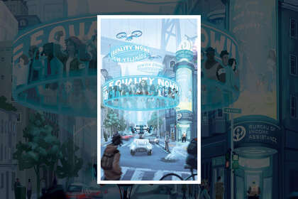
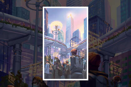
Week 2: Closing the Gap
I was thinking about protesting in the future. Nowadays people have to be down on the street. That’s hard to control. I wanted to think about controllable vehicles that could project holograms of all the protesters, so that they wouldn’t have to actually go out, and the way it would make people notice is by voice or sound. It was a fictional vision of what a protest could be.
And of course I used blue cause it’s a color scheme you often see in futuristic movies.
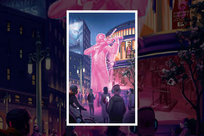
Week 3: The Future of the Arts
This was really challenging in terms of perspective and having to connect with the last panel. Davies Symphony Hall is quite a wide building, and I had to adjust into a vertical ratio. There’s no way. My solution was to put it in the front and just fake the perspective. I used the scale of people to give it a sense of size and make it contrast from the middle musician.
I was thinking about the color of the panel. Since I already used blue, I put pink and purple. This color scheme actually comes from the “Blade Runner” movie. I fused that idea into this panel a little bit.
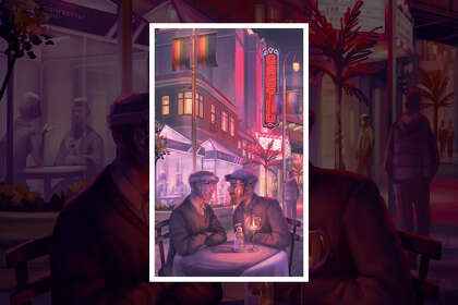
Week 4: The Social Scene
Since it’s the Castro, I wanted to bring up the LGBTQ topic in this panel. That’s why I put the male couple in the front.
One of the things I looked at in the future was hand sanitizer being a normal thing that people use. It’s on the dining table even. They use it before they eat. Or, on that date, it’s the new normal. Like, oh, I can’t touch their hand until I use it first.
Week 5: The Tech Sector
I think I like this one the most since the composition features the Salesforce Tower. It’s really tall, so it was the easiest one to compose since I could compose something in a vertical view.
It’s the first time I actually had to paint a glass building and represent the Financial District. It was the easiest one and also the most challenging because, once I got into details, I had people in the front and details on the building. I had to figure out a way to push the buildings away so it didn’t feel too dense for viewers.
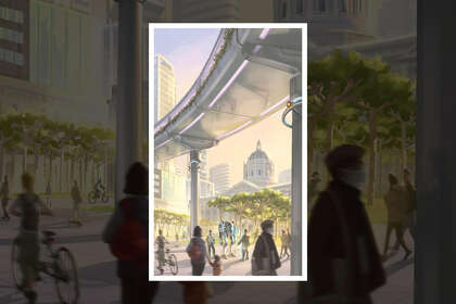
Week 6: Rewriting the Rules
I wanted to free up the viewer a little bit, so I put the camera farther out after having very tight compositions in the previous illustrations. This one I just tried to have the feeling of the space in Civic Center.
When I walked there, the feeling of the space — the air, the space between me and City Hall — it made me feel like it’s a gigantic place and yet a space that I was still able to walk through.
It also has futurist elements that come from other panels. That’s why I have the skywalk bridge at the top. It connects it to the previous panel. I was worried it might be too big, but in the overall panorama, it wasn’t as bad as I thought.
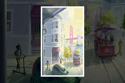
Week 7: How We Move
Since the suggestion was people feeling more hope and feeling more lively, I put a little story in there about a couple who may not have seen each other that much. I wanted it to say that now you can meet the people you love.
I chose Pacific Avenue. I sketch there all the time, and I walk and jog there. There’s a great view, and it just felt right to give a hopeful feeling of the city.
It’s fictional. It’s visually just my feelings that I mashed into that space that could work in a vertical ratio. I was really concerned about the perspective. I really worried people would find out that you don’t see cable cars and the Golden Gate Bridge in the same place, and that you wouldn’t see the bridge from Pacific ever like this.
This is actually the view from California and Mason, but in reality it’s a framing of the Bay Bridge. This city is like a composition by itself, and I tried to translate it into this picture. It’s a VisDev (visual development) artist skill: We mess things up and make it look possible.
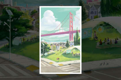
Week 8: The Community
I had the same worry as the previous panel. I mixed things up, and hopefully viewers wouldn’t catch it or be mad about it not being true. Like the last one, I made the space feel more free with a lot of air between viewers and the scene. That’s why I used a lot of cool colors with just a touch of warm to make it like a normal sunny day, which is related to the happy ending of this series. It is just another normal day in which people can live their lives.
And on the screens in the outdoor classrooms, it’s like the pandemic is a memory already, that it happened in the past.
Alex K. Fong is the designer of the Throughline. Email: Alex.Fong@sfchronicle.com Twitter: @alexkfong
"story" - Google News
September 06, 2020 at 06:00PM
https://ift.tt/3bvxCQN
Anatomy of the covers: The story of the Throughline’s cover illustrations - San Francisco Chronicle
"story" - Google News
https://ift.tt/2YrOfIK
https://ift.tt/2xwebYA
Bagikan Berita Ini


0 Response to "Anatomy of the covers: The story of the Throughline’s cover illustrations - San Francisco Chronicle"
Post a Comment